
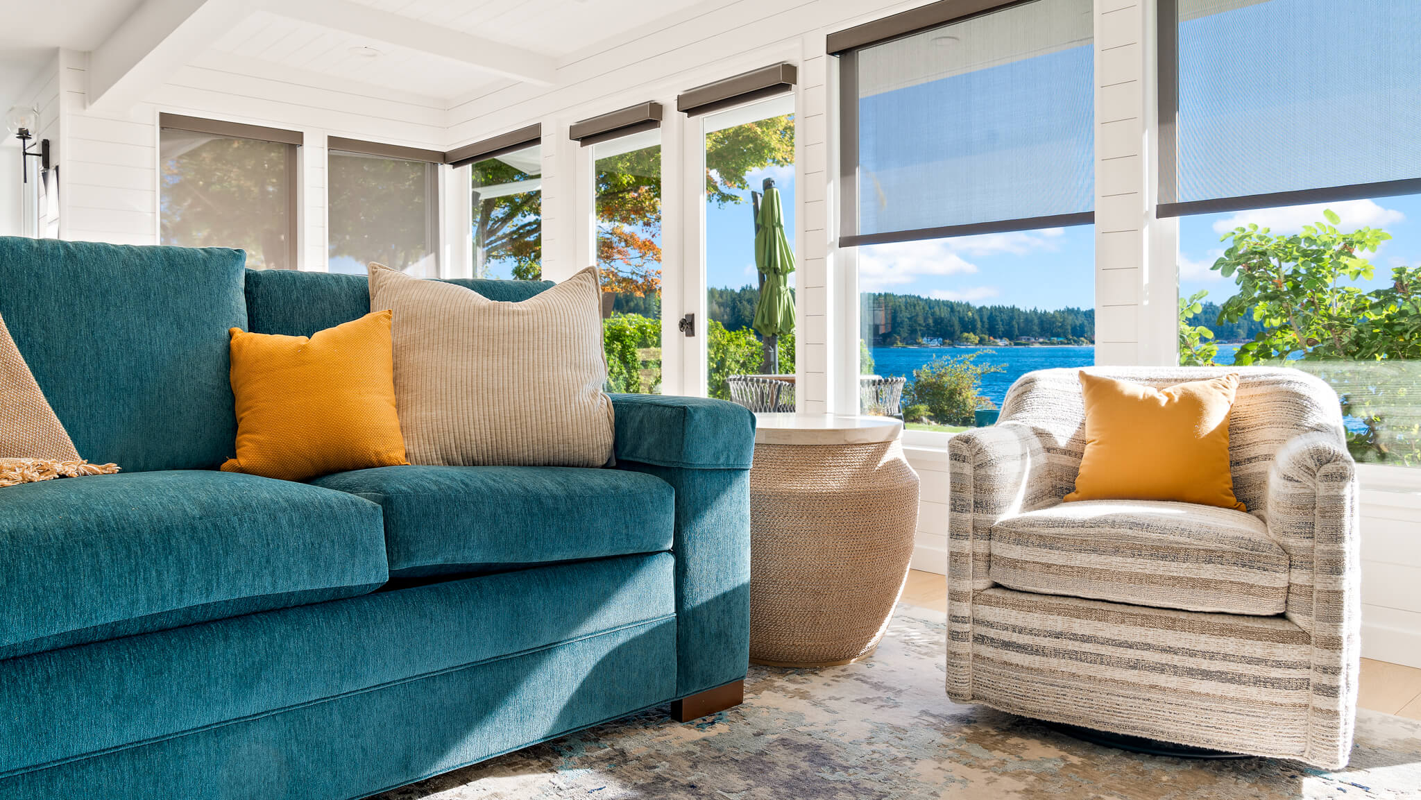
The most common interior design living room mistakes share one root cause: the room was decorated piece by piece instead of planned as a whole. Furniture gets pushed against the walls, one ceiling fixture is left to light the entire space, and artwork goes up at eye level for someone standing — not sitting. Living rooms often have to work around a view, a fireplace, and a walkway to the kitchen all at once, so these small missteps add up fast. In Kitsap County homes — the mid-century ranches and split-levels around Bremerton, Poulsbo and Bainbridge Island, and the newer open-plan builds on the Puget Sound side — these problems show up in a particular way, because the rooms are often modest rectangles asked to hold a view, a fireplace and a walkway all at once. Below are the seven mistakes Bluefoot Architecture & Design sees most often, along with what to do instead.
It feels like the safe choice — shove the sofa and chairs to the perimeter and leave the middle open. In practice, it flattens the room and kills conversation. Design research consistently finds that floating furniture arrangements, pulled a foot or two off the wall and angled toward each other, outperform wall-hugging layouts for both comfort and how large a room feels, according to Livingetc. In a lot of older ranch and split-level homes, the room is already a modest rectangle, so every inch of intentional layout matters more, not less. A simple starting point: pull the sofa 4–6 inches off the back wall, angle at least one chair toward the seating group rather than facing straight ahead, and resist the urge to line every piece up flush with a wall just because there’s room to do it.
This matters even more in open-concept living rooms that flow into a kitchen or dining area, which is increasingly common in newer construction. Without walls to define the space, furniture placement is the only thing signaling where the living room “starts” — so a floating arrangement isn’t just more comfortable, it’s doing structural work a wall would otherwise do.
Before finalizing any layout, walk the room and notice how people actually move through it — from the entry to the kitchen, from the hallway to the front door. Furniture that blocks that natural path forces guests to awkwardly route around it every time, and no amount of good decor fixes a layout that fights how the room gets used day to day.
A living room that “feels off” is often just a spacing problem. Furniture placed a few inches too close together forces people to turn sideways to pass, and a coffee table set too far from the sofa makes the whole seating area feel disconnected. Interior designers work from a fairly consistent set of clearance standards:
| Clearance | Recommended Space |
|---|---|
| Main walkway through the room | 36″ minimum (42″ is more comfortable) |
| Secondary walkway between furniture pieces | 30″ minimum |
| Sofa to coffee table | 14″–18″ |
| Between facing seating (sofa to chairs) | 6–8 feet |
Source: industry furniture-spacing standards compiled by Livingetc.
One ceiling fixture in the center of the room casts flat, cold light and leaves the edges of the room dim — a mistake that’s especially noticeable during the darker winter months, when natural daylight is already limited for weeks at a time. A well-lit living room layers at least three light sources: ambient (overhead or recessed), task (a reading lamp near seating), and accent (a lamp or sconce that lights a corner the ceiling fixture misses). If your living room only turns on with one switch, that’s usually the first fix worth making.
Art hung at “standing eye level” reads as disconnected from a room built around seated conversation. The general rule is to center artwork 57–60 inches from the floor to its midpoint when there’s no furniture below it, but when a piece hangs over a sofa or console, it should sit 6–8 inches above the furniture instead — not at the standard height. Getting this wrong is one of the most common reasons a living room feels “off” without anyone being able to say why, and it’s consistently named by professional designers as one of the top living room mistakes to fix, according to Homes & Gardens.
This one comes up constantly in living rooms with a great view: the room has to answer for a fireplace, a large TV, and a picture window all pulling attention in different directions. Rather than fighting the view, the strongest layouts pick one primary focal point — often the window, when there’s a view worth protecting — and arrange seating to support it, with the TV and fireplace treated as secondary. Trying to give all three equal weight is what makes a room feel scattered instead of restful.
Open shelving and floating media consoles look clean in photos and cluttered within a month. Living rooms that stay tidy usually have closed storage built into the plan from the start — a media cabinet with doors, a window seat with storage underneath, or built-ins flanking a fireplace. If clutter keeps creeping back into your living room no matter how often you tidy it, the layout is usually missing enough custom cabinet or built-in storage to begin with, not a discipline problem.
A rug that only fits under the coffee table, with all four furniture legs off it, makes a seating area look like it’s floating in the middle of an unfinished room. As a baseline, the front legs of your sofa and chairs should rest on the rug. On the flip side, buying a complete matching furniture set can make a small living room feel flat and showroom-like rather than lived-in — mixing at least one piece with a different shape, material, or era usually reads as more intentional, not less coordinated.
Most of these mistakes come from decorating in isolated decisions — a sofa here, a lamp there — rather than working from a single plan for how the room is used, lit, and moved through. That’s the gap Bluefoot Architecture & Design’s interior design services are built to close, from space planning through furniture and lighting selection. You can see examples of recently completed living rooms and full-home projects in our design portfolio.
Pushing all the furniture against the walls is the most common one. It feels practical, but it removes any sense of flow and makes conversation harder because seating isn’t angled toward a shared focal point.
Plan for at least 30–36 inches of walkway between major pieces, 14–18 inches between a sofa and coffee table, and 6–8 feet between seats that face each other. Tighter spacing than that tends to feel cramped even in a well-decorated room.
Usually it’s lighting or layout, not the decor itself. A single overhead light and furniture with no clear focal point are the two most common culprits — both are layout problems, not shopping problems.
Size it so at least the front legs of your sofa and chairs sit on the rug. A rug that only fits under the coffee table is the single most common rug mistake in living room design.
Yes — a single-room project is common and lets a designer solve layout, lighting, and storage together rather than one purchase at a time. Many homeowners start with the living room specifically because it’s the room guests see first.
If your living room has one or more of these mistakes, we can walk through the space with you and put together a layout, lighting, and furnishing plan that actually works for how you live. Contact Bluefoot Architecture & Design or call us at 360-602-2965 to talk through your living room.